Physical Address
304 North Cardinal St.
Dorchester Center, MA 02124
Physical Address
304 North Cardinal St.
Dorchester Center, MA 02124

If you search for a dark pool indicator, you usually run into two kinds of content.
The first kind treats dark pool activity like a magic signal — one number, one color, one line, and suddenly you’re supposed to know what institutions are doing.
The second kind is more useful: it explains that a real dark pool workflow is not one indicator at all. It is a combination of reported prints, relative activity, repeated price clusters, sector context, and historical reference levels.
That second version is the one worth using.
This guide breaks down what traders usually mean when they search for a dark pool indicator, what the strongest dark-pool-related signals actually are, and how to use them without turning institutional data into fiction.
A dark pool indicator is not a single standardized market indicator in the way RSI, MACD, or VWAP are standardized.
In practice, traders use the term to describe any tool or metric that helps surface unusual dark pool activity. That may include:
So when someone asks for the “best dark pool indicator,” what they usually want is not an oscillator. They want a way to answer three practical questions:
1. Where are institutions active?
2. Is that activity unusual?
3. Which price zones keep showing institutional participation?
That is a much better framing than hunting for one perfect metric.
Retail traders are trying to solve a very real problem.
Most charting platforms show public price and volume clearly, but they do not make institutional off-exchange activity easy to interpret. By the time a move becomes obvious on a chart, traders want to know whether large participants were already active underneath the surface.
That is why dark pool tools get attention. They promise a cleaner view of:
The demand is real. The mistake is assuming all dark-pool-related indicators are equally useful.
If you want a practical dark pool indicator workflow, these are the signals that matter most.
A large print can look dramatic while being completely routine for the stock.
What matters more is whether today’s dark pool activity is elevated relative to that ticker’s own baseline.
A $20 million print in a low-liquidity name may matter more than a much larger print in a mega-cap ETF. The stronger metric is often the ratio between current activity and recent normal activity.
That is why “unusual vs normal” is often the first real dark pool indicator worth checking.
One giant print can be interesting. Repeated prints in the same zone are often more useful.
When large activity keeps showing up around the same price range across multiple sessions, that area can become a meaningful institutional reference zone. Traders often use those clusters to study possible support, resistance, or future reaction areas.
A good workflow tracks repetition, not just headlines.
Share count alone can be misleading.
A 500,000-share print means something very different in a $15 stock than in a $400 stock. Serious dark pool analysis should include notional value so you can see the actual size of the capital involved.
A stock-level print becomes much more interesting when the broader sector is also active.
If one semiconductor name shows elevated dark pool activity, that may be noise. If multiple semiconductor names and the sector ETF all light up together, the story gets stronger. That does not guarantee direction, but it gives cleaner institutional context.
The best dark pool indicator is often not a signal on today’s chart at all. It is access to prior institutional activity.
Historical dark pool data lets you ask:
Without history, dark pool data becomes a feed. With history, it becomes a research tool.
This part matters just as much as the bullish marketing copy you see around the category.
Dark pool data can be useful. It can also be badly over-interpreted.
A dark pool indicator does not tell you:
That means a dark pool indicator should be used as a context layer, not a standalone trade trigger.
The best way to use it is to improve ranking, filtering, and level selection across a watchlist — not to pretend every print is a prediction.
Instead of asking for one dark pool indicator, use a stack.
Use a broad scan to identify where dark pool activity is elevated across sectors and tickers.
Pull the most active names and inspect recent print behavior, repeated zones, and relative activity.
Map the main institutional zones onto your normal chart workflow.
Compare current activity to prior dark pool clusters rather than treating today as a standalone story.
Ask whether the institutional context improves the setup you already like — not whether it creates a story out of thin air.
This is the difference between using dark pool data professionally and using it as market-themed astrology.
If you are comparing platforms or dashboards, judge them on workflow quality rather than on how dramatic the UI looks.
A strong dark pool indicator tool should help you ask better questions. It should not try to hypnotize you into thinking one metric sees the future.
MobyTick and DarkPoolHeatmap serve two different roles in a dark pool indicator workflow.
DarkPoolHeatmap is the faster free-entry point. It is useful when you want to:
It is a strong front door for free utility intent.
MobyTick is the deeper research workflow. It is designed for traders who want:
That combination makes more sense than pretending one chart overlay solves everything.
A single large print is not the same thing as a completed thesis.
Huge numbers attract attention. Unusual numbers create edge.
Stock-level activity is stronger when the sector is active too.
No historical comparison means no idea whether today’s activity is exceptional.
Dark pool data is most useful when it improves watchlist quality and level selection. It gets worse when it becomes a shortcut to certainty.
The honest answer: the best dark pool indicator is not one metric.
It is a workflow built around:
If a platform helps you combine those well, it is useful.
If it only gives you a dramatic label and a lot of certainty theater, it probably is not.
The search term dark pool indicator makes sense. Traders want a cleaner way to see institutional activity.
But the strongest dark-pool-based edge usually comes from a stack of signals, not a single indicator. The goal is not to predict the future from one print. The goal is to understand where institutions have been active, whether that activity is unusual, and which levels deserve more respect in your workflow.
If you want a free way to start, use DarkPoolHeatmap.com to scan sectors and active names.
If you want deeper historical research, alerts, and a full dark-pool-focused workflow, explore MobyTick Trading.
That is a much better use of dark pool data than chasing a fake magic line on a chart.
The chart below uses 30-day MobyTick cluster data for NVDA. Instead of pretending a dark pool indicator is one magic line, this is what a real indicator workflow looks like in practice: repeated activity bands, notional value concentration, and chart location.
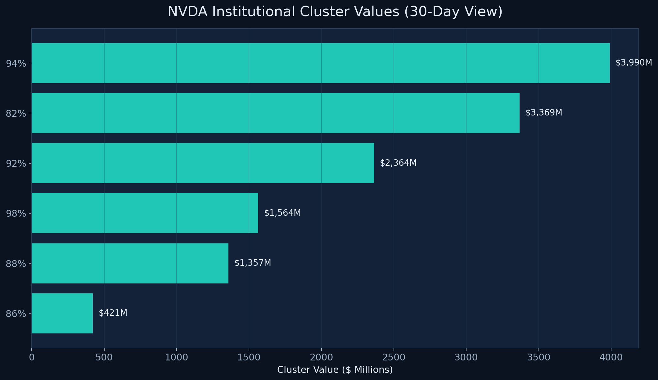
What stands out is the density of activity, not just the existence of one print. NVDA shows multiple large cluster bands: roughly $3,990M around 200.68, $3,369M around 176.28, and another $2,364M around 198.28. That is why traders should stop asking for a single dark pool indicator and start asking where the repeated institutional zones are.
In other words: the useful signal is layered. Relative activity, repeated price zones, and sector context are what make a dark pool workflow actually worth using. The chart gives the article a concrete example of that idea instead of leaving it as theory.