Physical Address
304 North Cardinal St.
Dorchester Center, MA 02124
Physical Address
304 North Cardinal St.
Dorchester Center, MA 02124

Smart money flow is one of those trading phrases that gets used constantly and explained badly.
Sometimes it means real institutional activity. Sometimes it means options flow. Sometimes it means dark pool prints. Sometimes it means a dashboard with a dramatic score and absolutely no explanation behind it.
So let’s clean it up.
If you want to track smart money flow in a way that is actually useful, the goal is not to find one magic label. The goal is to find evidence of where larger participants are active, whether that activity is unusual, and whether it is recurring in ways that matter.
That is where dark pool data becomes one of the most practical smart-money datasets available to retail traders.
In plain English, smart money flow usually means signs that larger or better-informed participants are active in a name, sector, or market theme.
That can include:
The phrase is broad, but the best use of it is narrow.
You do not need to pretend institutions are omniscient. You do not need to believe every large print predicts the next move. You just need a better read on where meaningful capital is showing up.
“Smart money” is a great marketing phrase because it sounds like shortcut access to certainty.
That is also why a lot of smart-money content is garbage.
Common problems:
The better framing is this: smart money flow is most useful as a context layer, not a prediction machine.
The strongest smart-money signals are usually tied to actual executed or reported activity. That is why dark pool data matters. It is grounded in reported transactions rather than sentiment theater.
A name showing 2x or 3x its normal institutional activity is often more interesting than a larger raw number in a ticker that is always busy.
One block can be interesting. Repeated activity in the same zone across sessions is often far more useful.
When several related names and the sector ETF are all active, the broader institutional story gets stronger.
Without history, smart money flow is just noise in the moment. With history, you can tell whether the activity is recurring, building, or fading.
Dark pool data is one of the cleanest ways for stock-focused traders to study institutional participation because it reflects actual reported off-exchange activity.
That makes it especially useful for answering:
Dark pool data does not tell you who traded or why. But it does help show where institutional participation is showing up in a way that can improve watchlist quality and level selection.
The embedded chart below is the best kind of antidote to vague “smart money” language. It shows a three-day sector share of classified dark pool flow, which turns the phrase into something measurable.
Instead of saying “smart money liked tech,” the data lets you say:
That is much more useful than a vibe-based interpretation. It shows that smart money flow is often best understood first as sector concentration, and only after that as a stock-by-stock story.
Use a broad sector-level view to identify where institutional activity is concentrated.
Once you know which sectors are active, identify the names with the strongest unusual activity or repeated cluster behavior.
Map repeated institutional zones onto your chart. This is where smart money flow becomes a usable part of execution planning instead of just another dashboard.
Ask whether the activity is a one-day spike or part of a recurring pattern.
Use the institutional context to rank candidates. Do not let it replace chart structure, catalyst awareness, or risk management.
This is not really an either/or.
Think of it more like this:
If you want a workflow that actually helps, dark pool data is usually the more concrete starting point. It gives you real reported activity rather than a vague label.
If you want a fast, free way to start tracking smart-money-style institutional activity, use DarkPoolHeatmap.com to scan elevated sectors and active names.
If you want deeper research, more historical context, and a workflow built around recurring institutional price zones, use MobyTick Trading.
That split makes a lot more sense than chasing mystery scores and hoping they mean something.
Smart money flow becomes useful when it helps you answer real questions:
That is why dark pool data matters so much in this conversation.
It is not mystical. It is not a guarantee. It is just one of the better ways to anchor the idea of smart money flow in reported institutional activity instead of hype.
That version is worth using.
The chart below shows the last three days of classified dark pool sector flow from our internal sector scanner. This is one of the cleanest ways to de-noise the phrase “smart money flow” and turn it into something measurable.
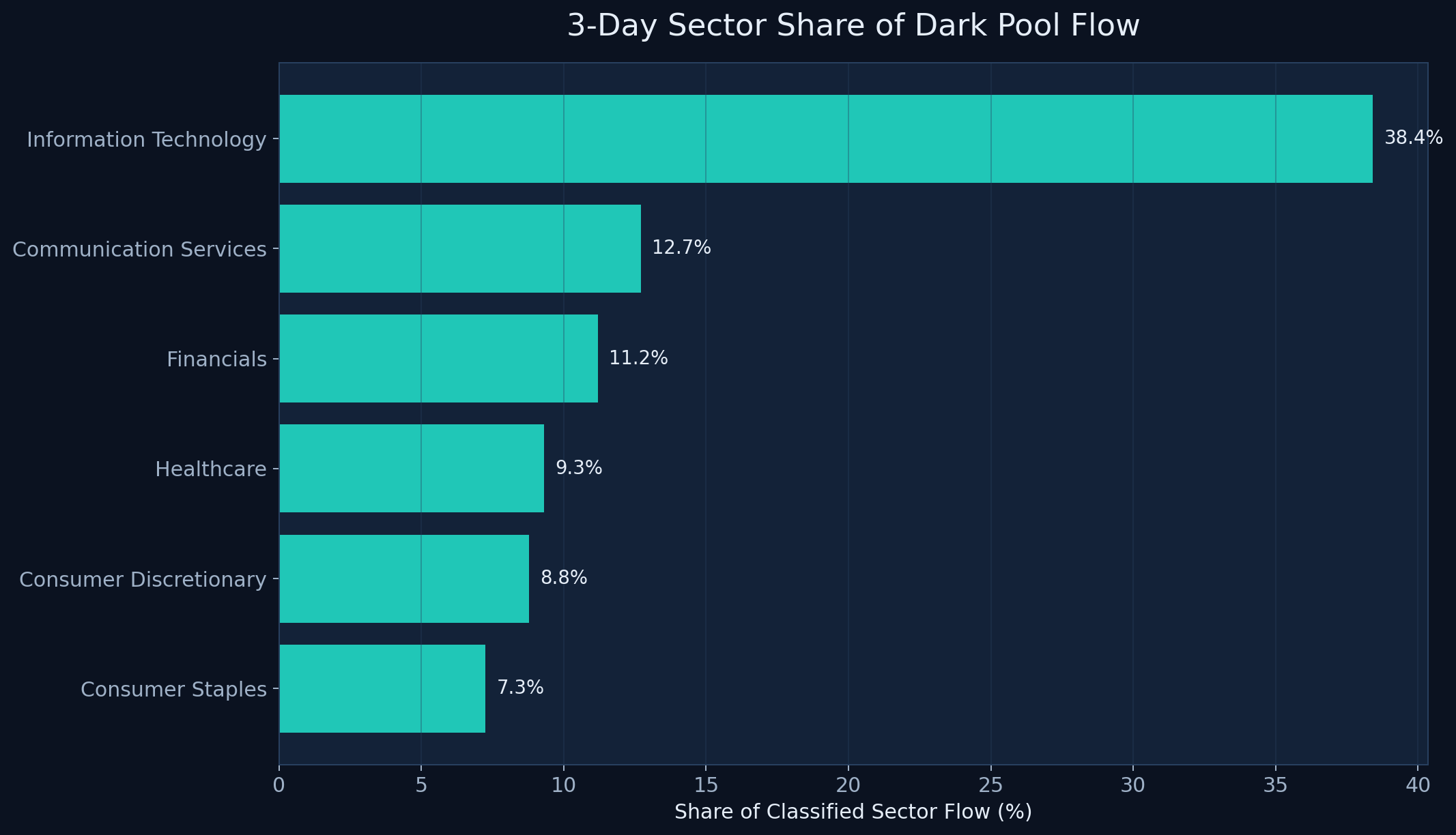
Technology alone accounted for roughly 38.4% of classified sector flow in our three-day scan, which is a much stronger statement than just saying “smart money liked tech.” Communication Services followed at about 12.7%, with Financials at 11.2%. That helps traders understand that smart money flow often starts with sector concentration before it turns into a stock-by-stock story.
Once you frame smart money flow this way, it becomes less mystical and more practical. The job is to find where capital is clustering first, then drill into the names driving that sector leadership.